From Old to Bold in Mountain View
- Aug 29, 2022
- 7 min read
This project came from a returning client. I initially designed their house in 2018, which you can read about here. When they bought a bigger house they reached out to me again. Returning clients are something I’m forever grateful for. It means so much to me that even if my schedule is fully booked I’ll always find time for them. The fact they trust me to ask me to transform their space again, and work together again, is something that I cherish.

Their new house in Mountain View, in the San Francisco Bay Area, is 2,700 sqft. It was in good shape but needed a facelift.
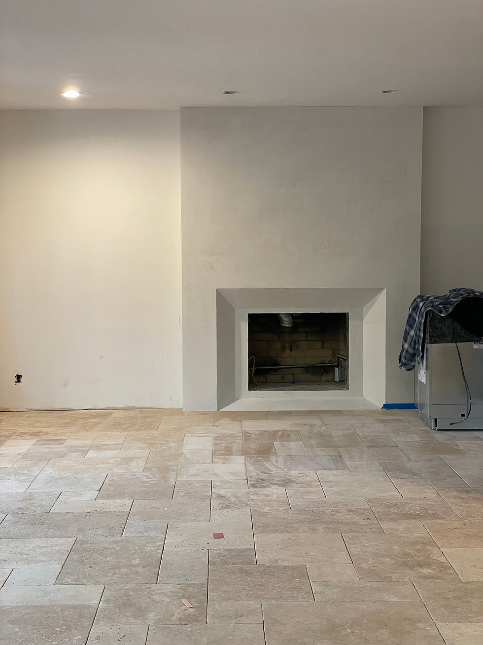
Firstly, we decided to change the flooring. Originally the floors on the ground level of the house had 2-inch white oak wood planks, and some of the areas had wall-to-wall carpeting. My client didn’t want wood flooring in the kitchen because wood absorbs spilled fluids, and in time will show the scratches and stains of daily wear-and-tear. The remedy would be some sort of tile flooring, but the challenge was to decide where the tiled section would start and where it would finish. There was also the question of what kind of tile would look best and fulfill its function as a high-trafficked area in the heart of their home. The tile choice, and layout design, would ultimately set the tone of that entire area. What look and feel were we going for, I wondered... Modern? Mid Century, like in their former home? Modern Farmhouse style? After some deliberations we honed in on their aspirational aesthetic, and then I knew that an Ivory Travertine tile, in a french pattern layout, would best suit this space. Once this decision was made it was clear that wide-plank white oak engineered flooring would blend well in the dining area and living room on the ground floor. To create a sense of natural continuation we also used the same oak flooring upstairs, on the second floor of the house. From this point all the other design elements of the house naturally fell into place in my head.

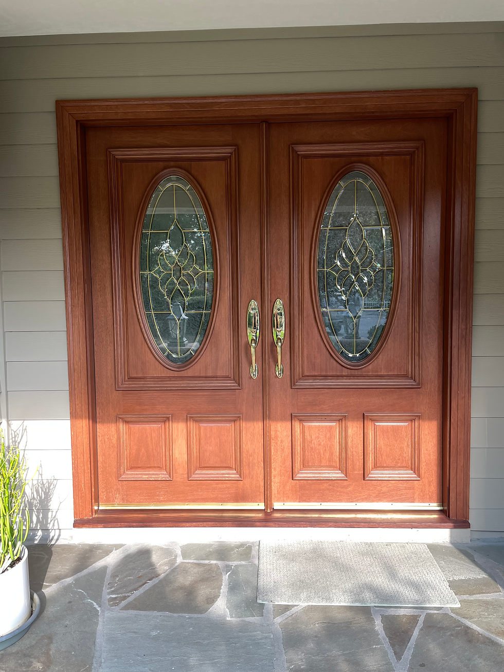
Entry:
We bid farewell to the dated double doors, and replaced them with a 42-inch wide oak door that has textured glass panels on either side of it. We painted the exterior of the house a soothing blue hue that blends beautifully with the blue-ish-gray front patio slate slabs. Finally, we mounted bronze and copper colored light fixtures by the door. Just by making these changes, without having to move any walls, the entrance to the home is completely transformed.

Before:
Upon entering the house, you immediately see a harmonious combination of travertine tile floor in french layout, and wood floors and stairs - framed by classic modern black stair railing - that in my opinion steals the show. This stair rail style is one that I had been wanting to try out for a long time. Luckily, my clients loved the idea and I love how it turned out. Also, by canceling the double front doors and replacing it with a single door, we gained functional space inside the house which provided space to build a bench with drawers for shoe storage, and coat hooks on the wall above it.

Before:

Hallway:
The hallway was dark and closed with storage cabinets. Although I will often go with as much storage as possible, in this case, I felt we needed to open up the hallway as much as we could to create a spacious walkway between the family room and the entryway. I designed a lower closed cabinet and on top, floating white oak floating shelves against vertical paneling. I especially love the pivoting brass fixtures.

Here is what it used to look like:

Kitchen and Family Room:
These rooms are, hands down, my favorite spaces in this home. I think it’s because when I had first set foot in these spaces I felt no inspiration at all. This feeling was unnerving and scared me for a moment. Usually, when I’m in a space I have a vision of how I think it should look. But in this case I drew a blank. What I did know is that I wanted to level the sunken floor to make it flush with the kitchen floor, which would ultimately lend more floor space for a kitchen table or breakfast nook. The best thing to do, in this uninspired situation, was to begin with what I knew for sure had to be done. Hopefully this starting point would result in a spark of creativity. I also knew that the widest wall in this area needed to be a focal wall.

To symmetrically design the focal wall I divided it into thirds. For each of the two outer thirds I built a bookcase made from white oak. The center third, in between the bookcases, features a fireplace painted in cream colored smooth stucco. Right above it hangs a large square piece of framed black-and-white photographic art. Matching brass-colored picture lights, at the top of each third, anchor this stream-lined look that feels warm yet modern.

Here is where I started from:

Progress photos:


Kitchen:
The next step was the kitchen. Since the kitchen cabinets were fairly new, and structurally in great shape, we felt that it would be wasteful to replace them entirely. Instead, we opted to replace only the cabinet doors. To give them some dramatic yet classy oomph, we painted them in a bold dark gray. The kitchen island was replaced because it was not only too long and narrow, but it also blocked the fridge and access to the table. To mirror the family room bookcases, the island is built from white oak. A couple of hanging clear carved crystal lamps hang above the island, making the space look airy and bright. Brass fixtures on the kitchen cabinets also mirror the mounted picture lamps in the family room. The tile backsplash is Zellige Moroccan tiles in a subway layout. The tiles’ imperfections boast subtle color shade differations, sheen and texture variations, which gives the whole look and feel depth and character. All this against the backdrop of the ivory travertine floor tiles is gorgeous to look at and gives this combined space an elegant aura.


Before:

Progress:


Living room and dining room:
When my clients bought the house, the dining room and living room were separated by a wooden rail. We tore down the rail to create a combined space. We chose wood flooring here, rather than tiles, to add warmth. Thankfully, my clients trusted me enough to let me design for them a veined marble fireplace that is unique and equally delicate and bold. This lovely fireplace defines the living room space.

Before:

This fireplace is sooo beautiful!

Above the dark wood dining room table we hung a modern hooped chandelier. The natural tones of the furniture work well with this brass and glass piece. Above the buffet hangs a colorful, fun and funky piece of art that excited me the second I saw it at the Las Vegas Furniture Store. The second I laid my eyes on it I knew that someday it would bring a room to life. I’m thrilled that my clients loved it as much as I do.


Look how amazing this room looks when the sun starts to set:

Primary bedroom:
My clients initially had their bed placed against the windows, but it didn’t look great. By changing the doorway from double doors to a single door, we created more wall space and were able to reposition the bed to this wall, which we decided to make into a focal wall. Vertical shiplap adds visual interest and the brass and black sconces on each side of the bed lend a modern nod. My clients bought new furniture for other rooms in the house, but decided to bring their bedroom furniture from their previous house that I designed, because it was new and they still love this Mid Century vibe, which works wonderfully in a classic modern farmhouse. The only new item in this room is the rug.


Primary bathroom:
We changed the layout of this room completely. When my clients bought the house, there was a shower and a pony wall that separated the toilet from the entrance. It was definitely a weird layout. When I designed my clients’ previous home I learned that they prefer a shower with two separate shower heads and valves. With this in mind I decided to build a separate toilet room. This allowed me to build a wide shower with two shower heads, a wide bench and two separate soapboxes.

Before:

On the walls we used handmade Fireclay ceramic tiles, with a band of Calacatta along the edge of the tiles, on the bench, and around the soapbox. On the floor we laid a limestone floor called Lagos Azul. I designed a white oak double vanity to suit their needs.

The plumbing and light fixtures have a polished nickel finish, and this finish is consistent throughout the bathroom.

This was the previous vanity:

Progress photos:


Kids’ Bathroom:
Here we wanted to maintain a similar aesthetic but at a lower cost. To achieve this we used the same polished nickel finish for the plumbing and light fixtures, and I designed a double vanity like that in the primary bathroom. We chose porcelain tiles for the floor and walls.

Before:

Progress photo:

Guest bathroom/Powder room:
This powder room/guest bathroom is the only bathroom on the ground floor of the house. It has to stand up to a lot of traffic. In this room we used the same marble vanity slab as the other bathrooms. We chose Fireclay tiles, that have a cool pink tint, for the floors. A band of Calacatta ties everything together, just like it does in the primary bathroom. The main challenge in this bathroom was the narrow dimensions of the room. With a width of less than 5 feet, the vanity had to be small. I didn’t want the space to look block-ish with a closed-door vanity, so I designed a freestanding vanity that is open at the bottom.
We chose polished nickel for the plumbing fixtures and brass for the light fixtures and hardware. A large round mirror, that spans across almost the whole width of the vanity, brightens the room. A brass curved hanging pendant light, to the side of the vanity, balances out this space.


Before and progress:

Progress photo:

I am thankful for the opportunity to design another house for my clients. It brings me joy to see the end result, and there is nothing more rewarding than seeing your clients enjoy the house you helped create for them.
Photographer: Vivian Johnson
Photoshoot Styling: Rachel Wanty


Comments