Willow Glen Full House Remodel
- Mar 11, 2022
- 6 min read
Let me tell you a funny story. Back in 2020 I designed a master bedroom and a bathroom for a super nice couple in Santa Clara. I loved the transformation and planned to photograph it for my portfolio, but when I approached my clients about it they told me that they had decided to sell the house and move to a bigger one. I never got to photograph their remodel before they sold the house, but six months later they called and asked me to come with them to look at a potential house purchase in Willow Glen, which is one of the beautiful neighborhoods in San Jose, CA. This single-family home featured several oddly angled exterior and interior walls, which presented challenges, yet I was thrilled to work with these clients again and I am always up for a challenge, so I swiftly took this project on.

We decided to leave all the oddly angled exterior walls intact, because we didn't want to move any exterior walls, and had to find creative design solutions for rearranging only the interior walls. The first thing to be tackled was the main wall of the house – the “the heart and soul of the house”-- that is the kitchen, and yes it has an angled wall.

For avid entertainers, like my clients, the kitchen in its original state was too small. Our top priority was to make it big enough to include a large island and a pantry. The cabinets were painted in a sage hue, and complimented by a white oak island and beautiful square zellige 4x4 tiles.
Here is how the kitchen used to look like:
Because of the odd angels, we had to figure out the right location of the kitchen island onsite. this location determined the location of the skylight, the pendants and the recessed lights around it.

This is how the kitchen looked when we had the drywall installed:

This is how kitchen looked before the remodel:

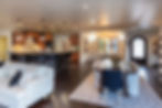
and how the kitchen looks after the remodel:

Since the tiles are made of natural materials, each tile differs slightly from one another. To make sure that the subtle color variations in the tiles worked well, as a whole backsplash, my clients and I had laid out the order of each tile before they were installed. Laying out tiles in front of you, before they are installed, is so important when working with natural materials such as marble and zellige, and I would not recommend leaving their wall placement to chance.


One of the spaces I particularly love in this house is the breakfast nook. The whole selection of kitchen materials began with a sage hued floral wallpaper. From this initial inspiration sprouted more ideas – we upholstered a purple bench and decorated it with pillows that had Indian patterns.


And this is how this nook looked before:

I had to open up the walls and break those separations.
Pantry:
We decided to place the new pantry at the back of the kitchen, and selected 6” hexagon terracotta tiles for the floor. Paired with the warm color of the walnut shelves, it looks earthy and divine. Since the pantry opening is narrow, neither a pocket door nor hinged door would fit. The best solution in this space was a barn door forged from metal and glass, that slides on a track mounted above the door opening. This type of door adds extra character to the room yet also blends naturally with the rest of the house.

Isn't it beautiful?

Some of the Kitchen's materials:

Living Room:
Since my clients love to entertain, it was important for them to have easy access to the back yard and for the transition between indoor and outdoor to feel seamless. To create a sense of seamlessness we substituted the sliding doors with a La Cantina bi-fold door. Then, to establish a common “language” between the outdoor and indoor spaces, we furnished the room with a wide sectional sofa and a rug that features hints of sage. This resonates well with the sage-colored kitchen visible behind the sofa.

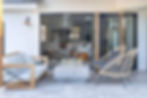
Here is another angle of the new porch. I love these travertine tiles:

Entrance:
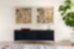
This public area of the house is spacious, so the beautiful console at the entrance functions as a perfect focal point. A pale pink vintage rug, and two pieces of framed art that I picked up during my last visit to Las Vegas Market, fit right in as elegant accents.
Mudroom:
The previous powder room’s layout was not ideal - to enter the laundry room you had to pass through the powder room. Also, the toilet was poorly placed and featured a pony wall that made it hard to see. I decided to convert the powder room into a mudroom and build a new powder room in the hallway.
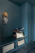
I enlarged the hallway by adding another 3’ space which I utilized as space for this new powder room. After all this maneuvering, the mudroom/coat room became one of my favorite rooms. We painted the walls, ceiling, and cabinets with the same dark color. The floor tiles are 6x24 black slate in a herringbone layout, but what steals the show are the cute animal hooks.
Before we painted the cabinets:

And this is how it looked before we started... Can you tell the difference?

Mudroom materials:

This new powder room now features a cool cement sink and a wall-mounted faucet in a champagne hue. For the backsplash we used Porcelanosa tiles - it looks like wallpaper. The rest of the room looks elegant and neutral.

New pass way:
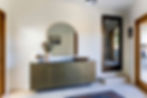
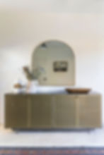
My client wanted to build an indoor passageway from the garage to the house. She wanted the passageway to feel like part of the house, yet not entirely integral to the living space in the main home. It is intended to be a walkway for those who live in the house, where they can access the backyard without having to put on shoes. Also, when they entertain guests in the backyard, the guests can walk through this passageway instead of through the house. And thus this unique space was born from a specific need. To create a natural and seamless “relationship” between these indoor and outdoor spaces, we used travertine floor tiles – the same tiles used for the backyard hardscaping. This passageway is furnished with a metal console, an oversized mirror, a framed painting, flowers in a light colored vase, and natural wood decorative elements, which are all tied together with a colorful ethnic rug. The result is a modern, beautiful, and sophisticated space.
Master Bathroom:
Before the remodel, the bathroom took up more space than the bedroom. It was so disproportionate that there wasn’t even room for a queen bed, let alone a king bed. To remedy this we moved the bathroom to an entirely different wall, constructed an enclave for the toilet, and built a steam shower (which was on my client’s “want” list). Moving the bathroom created a longer space, which freed up room for a double vanity, a makeup table, and a linen cupboard.

When tiling a steam shower, tiles should be extra durable and cover the ceiling too – we chose natural looking ceramic tiles in gradient neutral hues. The floor was laid with Calcutta mosaic, with a decorative band along the edge. The vanity is custom built from white oak. White vertical shiplap on the wall behind the mirrors introduces another type of material to the room and also adds another element of interest. The straight-lined countertop gives this bathroom a modern feel, and the small shelf above the countertop adds extra detail and storage.

Because marble is natural material with a lot of variance, when working with marble, I want to be able to lay the tiles in a way that the veins in the tiles complement one another. This is the layout of the master bathroom bench:


Here is how the bathroom looked like before:
This shower was transformed into the new toilet room.

And the location where this vanity was before, is now the new master bedroom wall.

Master Bathroom Materials:

Master Bedroom:
What made this part of the project convenient is that six months earlier, when my clients were still living at their previous address, we had already redesigned their bedroom. This meant that most of the furniture had already been acquired. To re-work the same concept in the new house all we had to do was to introduce a couple of additional interior design pieces. We added a new rug that worked better with the proportions of the longer room, and even had room for a sofa at the foot of the bed. The sofa’s light shade of pink worked nicely with the art above the bed.


To sum it up, this house in Willow Glen was a long and at times challenging project, but working with these returning clients has been such a rewarding treat for me, so I can confidently say that this project turned out to be a really delightful experience.

Here are the before and after plans. If you are anything like me, you'll have fun looking at the differences:
Existing plan:

And Proposed plan:
